Properties panel
Properties panel |
|
|
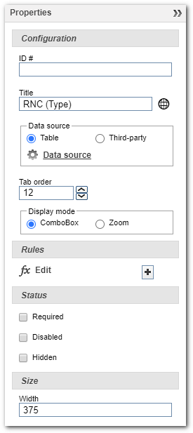
This panel allows to handle the properties of the items that make up the form. See how to configure each one of them.
ConfigurationID #: Enter an ID # for the item. Title: Enter a name for the item. The name is the text that will be displayed next to or above each item or field in the form. If the location is enabled, in the data of the form, then the Field: Select, in this field, the attribute that corresponds to the value to be entered in the form. This image is displayed for the following item: Input, Checkbox, Radiobutton, SpinInput, Date, Time, File, Text, and Image. Remember that only attributes of the type that corresponds to the selected item will be displayed, for example, for items of CheckBox, the system will display boolean type attributes, for Text items will be displayed attributes of text type with 4000 characters, among others. Value: Enter in this field the value referring to the option. This field is displayed for the items of Radio button type. Tab order: Enter the number that corresponds to the fill order of the form item. This field is displayed for the following items: Input, List of values, Checkbox, Radiobutton, SpinInput, Text, Date, Time and File. Display mode: Configure this field if the list of values will be displayed in a ComboBox or Zoom. This field is displayed only for the items of List of values type. Data source: This field is displayed for items such as Grid, List of values and Button. In case of Grid item type, configure the relationship that will be used by the grid. In case of List of values or Button item type, configure the data source to be used in the selected item. The data sources may be tables, datasets, or webservices. For more details on setting up grids or data sources, refer to the Data source - Grid, Data source - ComboBox, Data source - Dataset, Data source - Web Service, and Data source - REST Web Service sections. Editable grid: This option is displayed only for the Grid item. Check this field to make it possible fill the data directly on the grid, without the need to open another form to fill out. It is possible to enter text, decimal, number, date, time, and boolean. File fields and list of value are not editable directly on the grid. Since there is no subform of the grid, no formulas will be executed from the fields, however, the formula of grid change will be performed normally. Font size: Select the font size for the title. This field is displayed for the Title and Form revision items. Template: Select in this field the template that has the image that will be used in the form image or button. In the case of the image item, it is possible to check the Real size option so that the image is displayed at the original size. Display revision date: Check this option so that the revision date is also shown in the form revision component. Signature: The following fields are only displayed for the Signature item: ▪Signature type: Define whether the signature of the form will be written or whether it will be from an image. The first allows you to write in a predetermined area. ▪Fields: Select in this field the attributes that will save the user's signature, name, and user ID. ▪Display: Select whether the user's name and/or ID will display on the form. ▪Restricted to: It is also possible to restrict the signature so that only a particular User can sign. Example: Only the CEO of the company can sign.
RulesInput: Click on the Output: Click on the Edit: Click on the Click: Click on the
StatusRequired: By selecting this option, the Disabled: By selecting this option, the component will be disabled, not allowing filling/editing. This field is displayed for the following items: Input, List of values, Checkbox, RadioButton, SpinInput, Date, Time, File, Text, Grid, and Button. Hidden: By selecting this option, the component will not be displayed in the form. This field is displayed for the following items: Input, List of values, Checkbox, RadioButton, SpinInput, Date, Time, File, Text, Grid, FieldSet, Title, Button, and Image.
SizeWidth: Enter the desired width for the item in question. Height: Enter the desired height for the item in question. |
 button will be displayed to be informed the
  button to configure the input formula that will be executed when a value is entered in the item.
 icon will be displayed next to the component in question, making it mandatory to fill it in during the execution of the form.