|
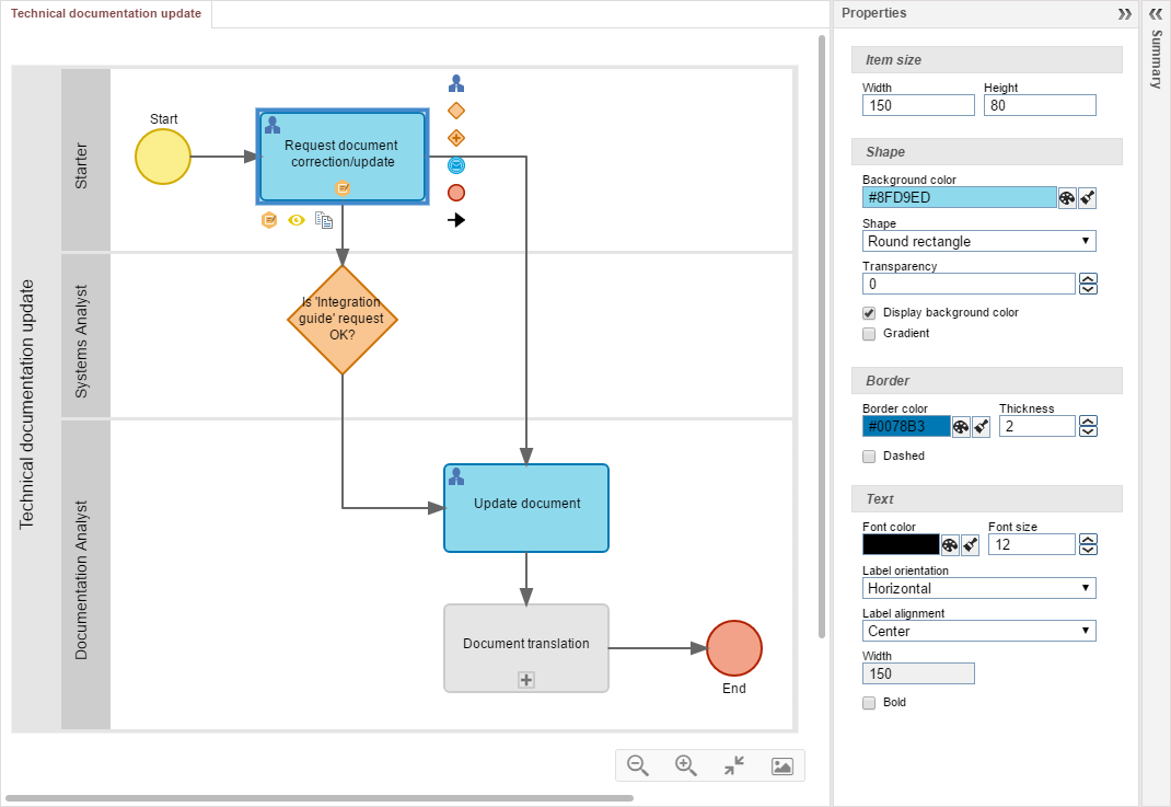
To view and/or edit the properties of the process items, first select the desired item in the flowchart. At this point, the properties of the selected item will be loaded on the right-side. If the Properties panel is contracted, the user should click on it to expand it. See the description of each field in each section of this panel:

Item size
Use the fields of this section to determine the size of the item selected in the flowchart:
Width: This field shows the width of the selected item. To edit it, click on the field, type a new value for the width and press ENTER.
Height: This field shows the height of the selected item. To edit it, click on the field, type a new value for the height and press ENTER.
|
Shape
Use the fields of this section to determine the shape of the item selected in the flowchart:
Background color: This field shows the background color of the selected item. To edit it, click on the  button and select one of the colors in the palette that will open up. button and select one of the colors in the palette that will open up.
Shape: In this field, the item shape is configured. Remember that according to BPM specifications, each item has a standard shape, but it can be changed to another shape. The available options are standard, rectangle, circle, ellipse, trapezoid, parallelogram, pentagon, hexagon, octagon, heptagon, diamond, triangle, inverted triangle, triangle to the left, triangle to the right, annotation, rounded rectangle.
Transparency: This field shows the transparency of the item. Use the arrows next to this field to increase or decrease transparency.
Display background color: Check this option for the selected item to have a background color.
Gradient: Check this option to enable the gradient effect on the background and border of the selected item.
|
Border
Use the fields of this section to determine the size of the item selected in the flowchart:
Border color: This field shows the border color of the selected item. To edit it, click on the  button and select one of the colors in the palette that will open up. button and select one of the colors in the palette that will open up.
Thickness: This field shows the thickness of the item border. Use the arrows next to this field to increase or decrease the thickness.
Dashed: Check this item for the item border to be dashed.
|
Text
Use the fields of this section to determine the size of the item selected in the flowchart:
Font color: This field shows the font color of the selected item. To edit it, click on the  button and select one of the colors in the palette that will open up. button and select one of the colors in the palette that will open up.
Font size: This field shows the font size of the item. Use the arrows next to this field to increase or decrease the size of the font.
Label orientation: In this field, it is possible to set the text orientation of the item. Select this field, if the label orientation of the selected item should be horizontal or vertical.
Label alignment: In this field, it is set the text orientation regarding the item drawing. Select one of the following alignment options: right bottom, right, right top, left bottom, left, left top, bottom, center, top, outside bottom and outside top.
Width: In this field, it is set the width of the area used by the text. This field will come filled with the width of the item, however, the text area can be greater if the item is small or when the text is located outside the item area.
Bold: Check this item to turn the text of the selected item, bold.
|
|


