|
This section displays the components that can be designed in the responsive form. After dragging the element to the designing area, it will be selected, and a tab with several options that allow deleting, resizing and configuring the component will be displayed:
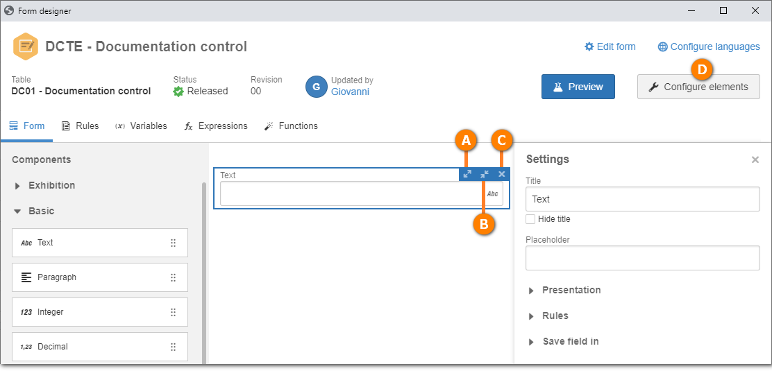
A
|
Increases the width of the component. The width is increased to the right size of the component, decreasing the size of the components that are on the right.
|
B
|
Decreases the width of the component. The width is decreased to the right size of the component, increasing the size of the components that are on the right.
|
C
|
Deletes the component from the form.
|
D
|
Allows performing the configurations of the component selected in the form. See below the configurations available for each component of the responsive form.
|
Exhibition
Components
|
Description
|
Configurations
|
Panel
|
In the form, the panel is displayed as a highlight for the entire area. Use this component to separate fields of the form into areas. Then, drag the desired fields to this element. It is not possible to drag a panel into panels, sections or cards.
|
Title: Enter the name that will be displayed as the title. Check the "Hide title" option for it not to be displayed.
Presentation: Define how the panel will be displayed in the form:
▪Hidden: Check this option for the panel to be hidden and to only be displayed if a rule makes this panel visible. ▪Collapsible: Check this option for the panel to have the feature to be collapsed (or minimized) when completing the form. ▪Collapsed by default: Check this option for the panel to initially be displayed collapsed and for it to be possible, during completion, for the user to expand and collapse the panel as needed. |
Section
|
Just like the Panel, this component can be used to separate form fields into areas, but there is no visual limit to the section area. Drag the desired fields into this element. It is not possible to drag a panel into a section, but other sections can be dragged into a section.
|
Title: Enter the name that will be displayed as the title. Check the "Hide title" option for it not to be displayed.
Presentation: Define how the section will be displayed.
▪Hidden: Check this option for the section to be hidden and to only be displayed if a rule makes this section visible. ▪Collapsible: Check this option for the section to have the feature to be collapsed (or minimized) when completing the form. ▪Collapsed by default: Check this option for the section to initially be displayed collapsed and for it to be possible, during completion, for the user to expand and collapse the section as needed. |
Card
|
The card also allows separating form fields into a certain area, but it does not have the collapse and expand features. On the other hand, the card can have a specific background color and its border, which is displayed by default, can be hidden. It is not possible to drag a panel into a card, but sections can be dragged into cards.
|
Title: Enter the name that will be displayed as the title. Check the "Hide title" option for it not to be displayed.
Adjustments: Use the "Background color" field to define a color for the card. Check the "Hide border" option if the border of the card does not need to be displayed.
Presentation: Check the "hidden" option for the card to be hidden until certain information entered in another field makes it visible, through the execution of a rule.
|
Title
|
Use this component to enter a title for the form. It will be possible to set the size of the title area, adjust the alignment of the text, the color and the size of the font and the background color, as well as to define if the font will be bold and/or italic.
|
Title: Enter the name that will be displayed as the title.
Height: Enter the height for the title area.
Adjustments: In the "Alignment" field, define the alignment of the title text. In the "Background color" field, define the background color for the title area.
Font: In the "Font size" field, define the size of the font of the title. And in the "Font color" field, define the color of the font of the title. Use the "Bold" and "Italic" options to set the title as bold and/or italic.
Presentation: Check the "hidden" option for the title to be hidden and to only be displayed if a rule makes this title visible.
|
Image
|
Use this component to add an image to the form. It is possible to use the default system logo, the report logo or a customized image. The default logo and the report logo are set in the SoftExpert Configuration component (Configuration  System). System).
|
Title: Enter a name to the image.
Height: Enter the height for the image.
Image: In the "Display" field, define if the displayed image will be the default logo, the report logo or an image. If an image is chosen, use the "Select image" button to upload the desired image. In the "Size" field, define if the image will be displayed in real, proportional or extended size. It is worth noting that the size of the image area is composed of the height set in the "Height" field and the "Width" defined in form design.
Adjustments: In the "Alignment" field, define the alignment of the image.
Presentation: Check the "hidden" option for the image to be hidden until certain information entered in another field makes it visible, through the execution of a rule.
Rules: Select the rule that will be executed when clicking on the image.
|
Basic
Components
|
Description
|
Configurations
|
Text
|
Use this component to add a field that allows entering text type data. For this item, a new field can be created in the form table, or a previously created text type field, of 50 or 255 characters, can be selected.
|
Title: Define a title for the field. Click on the "Hide title" option for the title not to be displayed.
Placeholder: Use this field to enter the text that must be displayed written in the form field. This feature can be used to indicate to the user how to fill out this field.
Configure mask: Allows configuring a mask to fill out the text field. The mask has three configuration types: Free format, Simple mask, and Regular expression. Thus, it is possible to define completion patterns, such as phone numbers, postal codes, social security numbers, car plates, etc. After configuring the mask, click on "Apply".
Presentation: Define how the field will be displayed.
▪Required: Check this option for the completion of this field to be mandatory. ▪Disabled: Check this option for the field to be disabled (unable to be filled out) until a rule enables it. ▪Hidden: Check this option for the field not to be displayed until a rule makes this field visible. Rules: Define the rules that will be executed when focusing on and/or removing the focus from the field.
▪Focus: Select the rule that will be executed after focusing on this field. ▪Remove focus: Select the rule that will be executed after removing the focus from this field. Save field in: Each field of the form must be associated with a field of the table. Thus, define if the form field will be associated with a new table field (which will be automatically created by the system) or if an existing table field will be selected. If a table field that is being used in another form field is selected, a sequential value will be added to the end of the name of the field being used.
|
Paragraph
|
Use this component to add a field that allows entering text type data. For this item, a new field can be created in the form table, or a previously created text type field, of 4000 or unlimited characters, can be selected.
|
Title: Define a title for the field. Click on the "Hide title" option for the title not to be displayed.
Placeholder: Use this field to enter the text that must be displayed written in the form field. This feature can be used to indicate to the user how to fill out this field.
Height: Enter the height for the paragraph.
Limits: Enter the minimum and maximum number of characters that can be filled out in the paragraph.
Presentation: Define how the field will be displayed.
▪Required: Check this option for the completion of this field to be mandatory. ▪Disabled: Check this option for the field to be disabled (unable to be filled out) until a rule enables it. ▪Hidden: Check this option for the field not to be displayed until a rule makes this field visible. Rules: Define the rules that will be executed when focusing on and/or removing the focus from the field.
▪Focus: Select the rule that will be executed after focusing on this field. ▪Remove focus: Select the rule that will be executed after removing the focus from this field. Save field in: Each field of the form must be associated with a field of the table. Thus, define if the form field will be associated with a new table field (which will be automatically created by the system) or if an existing table field will be selected. If a table field that is being used in another form field is selected, a sequential value will be added to the end of the name of the field being used.
|
Integer
|
Use this component to add a field that allows entering number type data. For this item, a new field can be created in the form table, or a previously created number or long number type field can be selected.
|
Title: Define a title for the field. Click on the "Hide title" option for the title not to be displayed.
Placeholder: Use this field to enter the text that must be displayed written in the form field. This feature can be used to indicate to the user how to fill out this field.
Presentation: Define how the field will be displayed.
▪Required: Check this option for the completion of this field to be mandatory. ▪Disabled: Check this option for the field to be disabled (unable to be filled out) until a rule enables it. ▪Hidden: Check this option for the field not to be displayed until a rule makes this field visible. Rules: Define the rules that will be executed when focusing on and/or removing the focus from the field.
▪Focus: Select the rule that will be executed after focusing on this field. ▪Remove focus: Select the rule that will be executed after removing the focus from this field. Save field in: Each field of the form must be associated with a field of the table. Thus, define if the form field will be associated with a new table field (which will be automatically created by the system) or if an existing table field will be selected. If a table field that is being used in another form field is selected, a sequential value will be added to the end of the name of the field being used.
|
Decimal
|
Use this component to add a field that allows entering decimal (number) type data. For this item, a new field can be created in the form table, or a previously created decimal type field can be selected.
|
Title: Define a title for the field. Click on the "Hide title" option for the title not to be displayed.
Placeholder: Use this field to enter the text that must be displayed written in the form field. This feature can be used to indicate to the user how to fill out this field.
Presentation: Define how the field will be displayed.
▪Required: Check this option for the completion of this field to be mandatory. ▪Disabled: Check this option for the field to be disabled (unable to be filled out) until a rule enables it. ▪Hidden: Check this option for the field not to be displayed until a rule makes this field visible. Rules: Define the rules that will be executed when focusing on and/or removing the focus from the field.
▪Focus: Select the rule that will be executed after focusing on this field. ▪Remove focus: Select the rule that will be executed after removing the focus from this field. Save field in: Each field of the form must be associated with a field of the table. Thus, define if the form field will be associated with a new table field (which will be automatically created by the system) or if an existing table field will be selected. If a table field that is being used in another form field is selected, a sequential value will be added to the end of the name of the field being used.
|
Date
|
Use this component to add a field that allows entering date type data. For this item, a new field can be created in the form table, or a previously created date type field can be selected.
|
Title: Define a title for the field. Click on the "Hide title" option for the title not to be displayed.
Presentation: Define how the field will be displayed.
▪Required: Check this option for the completion of this field to be mandatory. ▪Disabled: Check this option for the field to be disabled (unable to be filled out) until a rule enables it. ▪Hidden: Check this option for the field not to be displayed until a rule makes this field visible. Rules: Select the rule that will be executed once changes are made to this field.
Save field in: Each field of the form must be associated with a field of the table. Thus, define if the form field will be associated with a new table field (which will be automatically created by the system) or if an existing table field will be selected. If a table field that is being used in another form field is selected, a sequential value will be added to the end of the name of the field being used.
|
Time
|
Use this component to add a field that allows entering time type data. For this item, a new field can be created in the form table, or a previously created time type field can be selected.
|
Title: Define a title for the field. Click on the "Hide title" option for the title not to be displayed.
Placeholder: Use this field to enter the text that must be displayed written in the form field. This feature can be used to indicate to the user how to fill out this field.
Presentation: Define how the field will be displayed.
▪Required: Check this option for the completion of this field to be mandatory. ▪Disabled: Check this option for the field to be disabled (unable to be filled out) until a rule enables it. ▪Hidden: Check this option for the field not to be displayed until a rule makes this field visible. Rules: Define the rules that will be executed when focusing on and/or removing the focus from the field.
▪Focus: Select the rule that will be executed after focusing on this field. ▪Remove focus: Select the rule that will be executed after removing the focus from this field. Save field in: Each field of the form must be associated with a field of the table. Thus, define if the form field will be associated with a new table field (which will be automatically created by the system) or if an existing table field will be selected. If a table field that is being used in another form field is selected, a sequential value will be added to the end of the name of the field being used.
|
Checkbox
|
Use this component to add a field that allows checking/unchecking an option. For this item, a new field can be created in the form table, or a previously created boolean type field can be selected.
|
Title: Define a title for the field.
Presentation: Define how the field will be displayed.
▪Disabled: Check this option for the field to be disabled (unable to be filled out) until a rule enables it. ▪Hidden: Check this option for the field not to be displayed until a rule makes this field visible. Rules: Select the rule that will be executed once changes are made to this field.
Save field in: Each field of the form must be associated with a field of the table. Thus, define if the form field will be associated with a new table field (which will be automatically created by the system) or if an existing table field will be selected. If a table field that is being used in another form field is selected, a sequential value will be added to the end of the name of the field being used.
|
Option group
|
Use this component to add a group with several options, of which only one can be selected. It is allowed to create up to 20 options. If more options are necessary, use the "Advanced list" component.
|
Title: Define a title for the field. Click on the "Hide title" option for the title not to be displayed.
Configure options: Click on this button to define the options that will be displayed in the group. On the screen that will be displayed after you click on this button, click on "Add option" and enter the options of this group. To edit the order, you can drag and position the option in the desired order.
Presentation: Define how the field will be displayed.
▪Required: Check this option for the completion of this field to be mandatory. ▪Disabled: Check this option for the field to be disabled (unable to be filled out) until a rule enables it. ▪Hidden: Check this option for the field not to be displayed until a rule makes this field visible. Rules: Select the rule that will be executed once changes are made to this field.
Save field in: Each field of the form must be associated with a field of the table. Thus, define if the form field will be associated with a new table field (which will be automatically created by the system) or if an existing table field will be selected. If a table field that is being used in another form field is selected, a sequential value will be added to the end of the name of the field being used.
|
Simple list
|
Use this component to add a list with several options, of which only one can be selected. It is allowed to create up to 20 options. If more options are necessary, use the "Advanced list" component.
|
Title: Define a title for the field. Click on the "Hide title" option for the title not to be displayed.
Configure options: Click on this button to define the options that will be displayed in the list. On the screen that will be displayed after you click on this button, click on "Add option" and enter the options of this group. To edit the order, you can drag and position the option in the desired order.
Presentation: Define how the field will be displayed.
▪Required: Check this option for the completion of this field to be mandatory. ▪Disabled: Check this option for the field to be disabled (unable to be filled out) until a rule enables it. ▪Hidden: Check this option for the field not to be displayed until a rule makes this field visible. Rules: Select the rule that will be executed once changes are made to this field.
Save field in: Each field of the form must be associated with a field of the table. Thus, define if the form field will be associated with a new table field (which will be automatically created by the system) or if an existing table field will be selected. If a table field that is being used in another form field is selected, a sequential value will be added to the end of the name of the field being used.
|
Button
|
Use this component to add a button to the form.
|
Title: Define a title for the button.
Presentation: Define how the field will be displayed:
▪Disabled: Check this option for the field to be disabled (unable to be filled out) until a rule enables it. ▪Hidden: Check this option for the field not to be displayed until a rule makes this field visible. Rules: Select the rule that will be executed after clicking on this button.
|
Advanced
Components
|
Description
|
Configurations
|
File
|
Use this component to add an area that will allow adding a file (a single file). For this item, a new field can be created in the form table, or a previously created file type field can be selected.
|
Title: Define a title for the file area. Click on the "Hide title" option for the title not to be displayed.
Height: Enter the height for the file area.
Presentation: Define how the file area will be displayed:
▪Required: Check this option for the addition of a file to this field to be mandatory. ▪Disabled: Check this option for the file area to be disabled (unable to add the file) until a rule enables it. ▪Hidden: Check this option for the file area not to be displayed until a rule makes this field visible. Save field in: Each field of the form must be associated with a field of the table. Thus, define if the file field will be associated with a new table field (which will be automatically created by the system) or if an existing table field will be selected. If a table field that is being used in another form field is selected, a sequential value will be added to the end of the name of the field being used.
|
Signature
|
Use this component to add an area that will allow adding a signature. Signing the form can be performed by hand or with the use of an image. The written form is recommended for the completion of the form in tablets or smartphones, as it will be possible to write in a pre-determined area of the form. When signing with an image, the digital signature of the user will be used, which must be recorded as an image in the user data. It is also possible to restrict the signature so that only a certain user can sign it. Example: Only the CEO of the company can sign.
|
Title: Define a title for the signature area. Click on the "Hide title" option for the title not to be displayed.
Height: Enter the height for the signature area.
Signature type: Define whether the signature will be a "written signature" or it will come from the "user signature image" recorded in the user data screen. The first option allows writing in a pre-determined area, while the second makes it possible to add an image of the signature in the user data and to use that image in the form, which will ask for the password/countersign to create the signature of the user on the form.
Restricted to user: It is possible to restrict the signature so that only a certain user can sign, such as: the CEO of the company. If necessary, define the user that will have permission to sign the form.
Presentation: Define how the signature area will be displayed:
▪User name: Check this option so that the name of the user who will sign it is displayed. ▪User ID: Check this option so that the ID of the user who will sign it is displayed. ▪Required: Check this option for the signature of the form to be mandatory. ▪Disabled: Check this option for the signature area to be disabled (unable to sign the form) until a rule enables this field. ▪Hidden: Check this option for the signature area not to be displayed until a rule makes this field visible. Save field in: Each field of the form must be associated with a field of the table. Thus, define if the signature field will be associated with a new table field (which will be automatically created by the system) or if an existing table field will be selected. If a table field that is being used in another form field is selected, a sequential value will be added to the end of the name of the field being used.
|
Advanced list
|
Use this component to add a list with options from another table, in which only one option can be selected. For this item, it will be necessary to define the table and the table field that has the values to be displayed in the list.
|
Title: Define a title for the field. Click on the "Hide title" option for the title not to be displayed.
Table and fields: Click on this button to define the table and the field that has the values that can be selected in this field. On the screen that will be displayed by clicking on this button, two tabs will be displayed: Table and Fields.
1.On the "Table" tab, select the desired table or click on "Create table" to create the table that will be related to the form. 2.On the "List" field, define the name of the relationship that will be created on the form table. 3.On the "Form to add a new record" field, select the form (if any) that will be used to add the records that will be displayed in the Advanced list field. 4.Access the "Fields" tab. All fields of the table selected in step 1 will be listed. 5.Select the necessary fields. If necessary, click on the + button to add a new field from the relationship table. 6.Click on "Apply" to relate the table of the form with the selected table. Presentation: Define how the field will be displayed:
▪Required: Check this option for the completion of this field to be mandatory. ▪Disabled: Check this option for the field to be disabled (unable to be filled out) until a rule enables it. ▪Hidden: Check this option for the field not to be displayed until a rule makes this field visible. Rules: Select the rule that will be executed once changes are made to this field.
|
Table
|
Use this component to add a table that allows associating several records, such as items from an order. For this item, it will be necessary to define the table and the field of the table that will work as columns for the form table.
|
Title: Define a title for the table/grid.
Height: Enter the height for the table/grid.
Table and fields: Click on this button to define the table and the fields that will be displayed as columns for the table/grid. On the screen that will be displayed by clicking on this button, two tabs will be displayed: Table and Fields.
1.On the "Table" field, select the desired table or click on "Create table" to create the table that will be related to the form. 2.On the "Grid" field, define the name of the relationship that will be created on the table selected in the previous step. 3.On the "Form to add a new record" field, select the form (if any) that will be used to add the records that will be displayed in the grid. 4.Access the "Fields" section. All fields of the table selected in step 1 will be listed. 5.Select the necessary columns. If necessary, click on the + button to add a new field from the relationship table. 6.Click on "Apply" to relate the table of the form with the selected table. Data source: For more details on setting up grids or data sources, refer to the Data source - Grid, Data source - ComboBox Data source - Dataset, Data source - Web Service, and Data source - REST Web Service sections.
Presentation: Define how the table will be displayed:
▪Disabled: Check this option for the table to be disabled (unable to be filled out) until a rule enables this field. ▪Hidden: Check this option for the table not to be displayed until a rule makes this field visible. Rules: Select the rule that will be executed once changes are made to this field.
|
Data source list
|
Use this component to add a list with options from a data source, in which only one option can be selected. The data sources allow using searches in external databases from third-party systems, such as CRM and ERP systems, among others.
The data source is created in the SoftExpert Administration component, through the "Configuration Data source Data source (AD047)" menu.
|
Title: Define a title for the field. Click on the "Hide title" option for the title not to be displayed.
Data source: Click on this button to define the data source and the dataset that has the values that can be selected in this field. On the screen that will be displayed by clicking on this button, three tabs will be displayed: Data source, Parameters and Persist info.
1.In the "Data source" tab, select the data source that will be used for the connection with the database. Note: The data sources displayed in this field were created in the SoftExpert Administration menu, through the AD047 menu. 2.On the "Dataset" field, select the dataset that has the query (Query/SQL). The dataset must be created in the "File Dataset" menu. 3.The "Parameters" tab will only be enabled if there is a parameter set for a condition (WHERE) of the query (Query/SQL) of the selected dataset. For example: if a dataset lists the users by department is selected, in which the department will go through a parameter, it will be necessary to define the source of the department parameter, which can be a form field, a variable or a fixed value. 4.Use the "Persist info" tab to select the variable that will receive the value (from the data source) that will be selected in the form. 5.Click on "Apply" to save the configuration of the data source list field. Presentation: Define how the field will be displayed:
▪Required: Check this option for the completion of this field to be mandatory. ▪Disabled: Check this option for the field to be disabled (unable to be filled out) until a rule enables it. ▪Hidden: Check this option for the field not to be displayed until a rule makes this field visible. Rules: Select the rule that will be executed once changes are made to this field.
|
Rich text
|
Use this component to add an area that allows entering rich text, that is, it allows formatting the text (defining or changing font type, size, and color, applying bold, italic, and underline), formatting paragraphs, inserting tables, links, and images. For this item, a new field can be created in the form table, or a previously created text type field, of 50 or 255 characters, can be selected.
|
Title: Define a title for the field. Click on the "Hide title" option for the title not to be displayed.
Presentation: Define how the field will be displayed.
▪Disabled: Check this option for the field to be disabled (unable to be filled out) until a rule enables it. ▪Hidden: Check this option for the field not to be displayed until a rule makes this field visible. Save field in: Each field of the form must be associated with a field of the table. Thus, define if the form field will be associated with a new table field (which will be automatically created by the system) or if an existing table field will be selected. If a table field that is being used in another form field is selected, a sequential value will be added to the end of the name of the field being used.
|
Integration
Components
|
Description
|
Configurations
|
Attachment
|
Use this component to add an area in which it will be possible to add or view attachments directly in the form. This resource is only available when the form is associated with a process activity with automation for SE Workflow, SE Incident or SE Problem.
|
Title: Define a title for the attachment area. Click on the "Hide title" option for the title not to be displayed.
Height: Enter the height for the attachment area. The minimum height for the attachment area is 15.
Presentation: Define how the attachment area will be displayed:
▪Disabled: Check this option for the attachment area to be disabled (unable to add files) until a rule enables it. ▪Hidden: Check this option for the attachment area not to be displayed until a rule makes this area visible. ▪Collapsible: Check this option for the attachment area to have the feature to be collapsed (or minimized) when completing the form. ▪Collapsed by default: Check this option for the attachment area to initially be displayed collapsed and for it to be possible, during completion, for the user to expand and collapse the panel as needed. |
Action plan
|
Use this component to view, add or edit action plans directly in the form. This resource will only be available if the form is associated with a process activity with automation for SE Incident or SE Problem. It is necessary for the activity of the process (that has the form) to be configured for the association or visualization of action plans.
|
Title: Define a title for the action plan area. Click on the "Hide title" option for the title not to be displayed.
Height: Enter the height for the action plan area. The minimum height for the action plan area is 15.
Presentation: Define how the action plan area will be displayed:
▪Disabled: Check this option for the action plan area to be disabled (unable to add or associate plans) until a rule enables it. ▪Hidden: Check this option for the action plan area not to be displayed until a rule makes this area visible. ▪Collapsible: Check this option for the action plan area to have the feature to be collapsed (or minimized) when completing the form. ▪Collapsed by default: Check this option for the action plan area to initially be displayed collapsed and for it to be possible, during completion, for the user to expand and collapse the panel as needed. |
Cause analysis
|
Use this component to perform the cause analysis directly in the form. This resource will only be available if the form is associated with a process activity with automation for SE Problem. The process activity must be configured for the cause analysis step.
|
Title: Define a title for the cause analysis area. Click on the "Hide title" option for the title not to be displayed.
Height: Enter the height for the cause analysis area. The minimum height for the cause analysis area is 15.
Presentation: Define how the cause analysis area will be displayed:
▪Disabled: Check this option for the cause analysis area to be disabled (unable to add or associate analyses) until a rule enables it. ▪Hidden: Check this option for the cause analysis area not to be displayed until a rule makes this area visible. ▪Collapsible: Check this option for the cause analysis area to have the feature to be collapsed (or minimized) when completing the form. ▪Collapsed by default: Check this option for the cause analysis area to initially be displayed collapsed and for it to be possible, during completion, for the user to expand and collapse the panel as needed. |
|