|
The responsive form editor or designer allows creating forms with a responsive interface, that is, that adjusts itself to the size of the screen in which the form is being filled out (desktop or mobile devices). With the responsive form designer, it is possible to create rules in a more intuitive way, without the need to use the Formula editor.
The responsive form designer uses the drag-n-drop feature, which consists of dragging the desired elements to the desired area in the form. Arrows will be displayed to indicate where the new element will be placed regarding another, previously edited element. As soon as the element is added to the form, it can be resized or dragged to another region, but its dimensions will be redefined according to the location in which it has been placed.
The following image displays the main features of the responsive form designer:
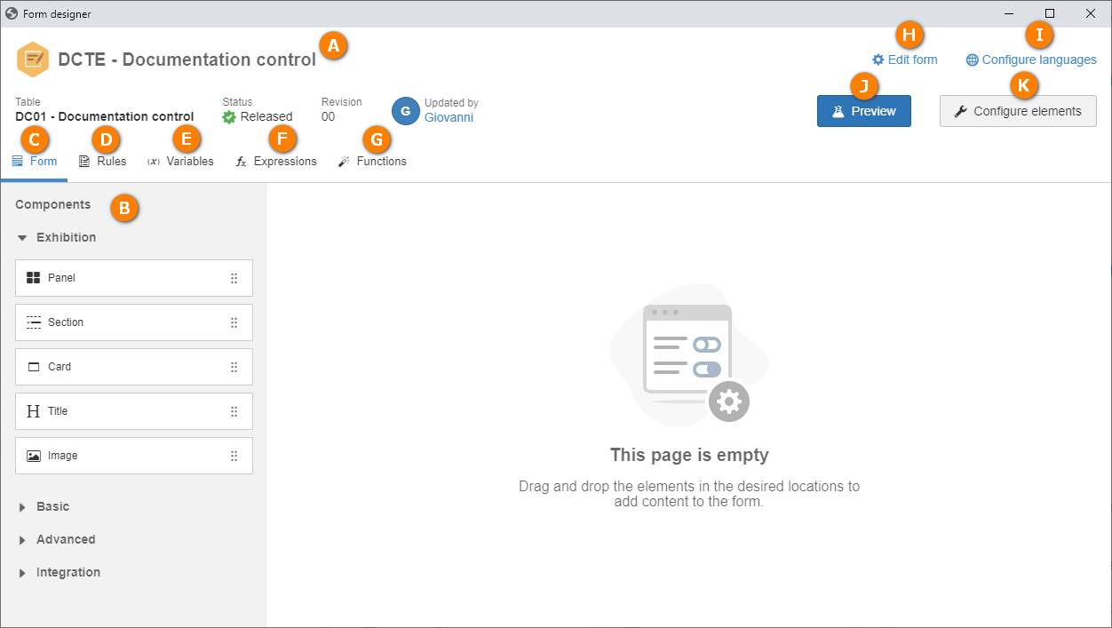
A
|
The header of the screen displays the form data, such as form ID # and name, table, status, revision number and user who updated the form.
|
B
|
The Components panel is located on the Form tab. In it, all components that may be used in the responsive form are available. See more details on the components in the Component panel section.
|
C
|
The Form tab is displayed by default when accessing the form designer. The form is designed through this tab.
|
D
|
In the Rules tab, it is possible to create the rules that will be used in the form fields. The rules allow comparing the information filled out in the fields and, based on the value, it is possible to display, enable or make required another form field. Through the rules, it is also possible to display messages or execute a dataset. See further details on the rules in the Rule configuration section.
|
E
|
In the Variables tab, it is possible to create variables that may be used as input parameters for a dataset or that may receive dataset values. See further details on the rules in the Rule configuration section.
|
F
|
In the Expressions tab, it is possible to create the math expressions using form fields, variables, other expressions, functions, and even fixed values, to update the values of the variables and other fields, allowing the creation of rules that use mathematical operations in addition to the existing conditional operations.
|
G
|
Use the Functions tab to create functions that later may be reused in other functions, rules, and math expressions, allowing the creation of robust and easy to understand rules.
|
H
|
The Edit form option allows editing the form ID #, name or type. It is also possible to define the rule that will be executed when loading the form and the rule that will be executed when saving/finishing the form.
Moreover, the Enable form to be used in the off-line application configuration is available. Enable this configuration for the responsive form to be filled out while off-line in the SoftExpert Workflow application. After saving the configuration, the system will issue a notification if there are inconsistencies in the form, and it will also modify the editor to display only the fields allowed in the application, simplifying modeling.
Forms with this option enabled must be associated with processes that also have off-line use enabled. Thus, it will be possible to start the process and fill out the form in the application while off-line.
Learn more about the configuration that enables the process and allows associating the form with off-line use in the SoftExpert Workflow application. Refer to the Editing process data  General process data Automation section in the SE Process component manual. General process data Automation section in the SE Process component manual.
|
I
|
The Configure languages option allows translating the form fields to one of the languages available in the system.
|
J
|
Click on the Preview button to view the form in its execution mode. The preview allows checking how the form is displayed in Desktop mode (pc or tablet) or Mobile mode (smartphones).
|
K
|
Click on the Configure elements button to perform the configurations of the component selected in the form. See more details on the components in the Component panel section.
|
|