Properties panel
Properties panel |
|
|
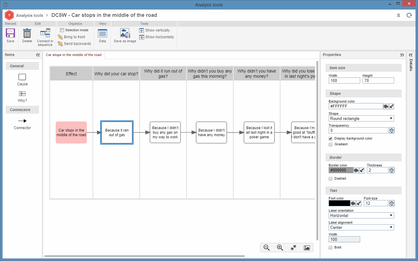
To view and/or alter the analysis tool diagram item properties, use the Properties panel. This panel displays fields that allow editing the graphic properties of the item selected in the diagram. If this panel is collapsed, just click on it to expand it. See in every section of this panel the description of each field:
Item size / Lane sizeUse the fields in this section to define the size of the item selected in the diagram:
Width: This field shows the width of the selected item. To edit it, click on the field, type a new value for the width and press ENTER. Height: This field shows the height of the selected item. To edit it, click on the field, type a new value for the height and press ENTER.
Lane shape / designUse the fields in this section to define the shape of the item selected in the diagram:
Background color: This field shows the background color of the selected item. To edit it, click on the Shape: This field sets the shape of the item. Remember that each item has a default shape, but it is possible to edit it to another shape. The available options are standard, rectangle, circle, ellipse, trapezoid, parallelogram, pentagon, hexagon, octagon, heptagon, diamond, triangle, inverted triangle, triangle to the left, triangle to the right, annotation, rounded rectangle. Transparency: This field shows the transparency of the item. Use the arrows next to this field to increase or decrease transparency. Display background color: Check this option for the selected item to have a background color. Gradient: Check this option to enable the gradient effect on the background and border of the selected item.
Border / Lane borderUse the fields in this section to define the border of the item selected in the diagram:
Border color: This field shows the border color of the selected item. To edit it, click on the Thickness: This field shows the thickness of the item border. Use the arrows next to this field to increase or decrease thickness. Dashed: Check this item for the item border to be dashed. This option will only be available when selecting a cause item in the "Ishikawa" or "5 Whys" diagrams, or when selecting a category of the "Ishikawa" diagram.
TextUse the fields in this section to define details of the item selected in the diagram:
Font color: This field shows the font color of the selected item. To edit it, click on the Font size: This field shows the font size of the item. Use the arrows next to this field to increase or decrease the size of the font. Label orientation: In this field, it is possible to set the text orientation of the item. Select this field if the label orientation of the selected item should be horizontal or vertical. Label alignment: In this field, it is set the text orientation regarding the item drawing. Select one of the following alignment options: right bottom, right, right top, left bottom, left, left top, bottom, center, top, outside bottom and outside top. Width: In this field, it is set the width of the department used by the text. This field will come filled with the width of the item, however, the text area can be greater if the item is small or when the text is located outside the item area. Bold: Check this item to turn the text of the selected item into bold.
TitleUse the fields in this section to define details of the title selected in the "5 Whys" tool:
Background color: This field shows the background color of the area of the title of the selected lane. To edit it, click on the Border color: This field shows the border color of the area of the title of the selected lane. For the border to be displayed, its thickness must not be 0 (zero). To edit the border color, click on the Thickness: This field shows the thickness of the border of the lane title area. Use the arrows next to this field to increase or decrease thickness. Transparency: This field shows the transparency of the lane title area. Use the arrows next to this field to increase or decrease transparency. Show background color: If this field is selected, the color defined in the Background color field will be displayed in the lane title area. Gradient: Check this option to enable the gradient effect in the background color of the lane title area.
Title textUse the fields in this section to define details of the lane title selected in the "5 Whys" tool:
Font color: This field shows the font color of the selected lane title. To edit it, click on the Font size: This field shows the font size of the lane title. Use the arrows next to this field to increase or decrease the size of the font. Bold: Check this item to turn the title of the selected item into bold. |
 button and select one of the colors in the palette that will open up.